Tuesday, March 1, 2011

Backsplash Tips - Part 1, Overall Color and Design


You've found your countertop and cabinets and now you're stuck. You can't decide what to do with the backsplash. Many people get hung up here. They tend to overthink it and make more of it than it really is. The reality is, most of the time a backsplash is covered up with kitchen items, small appliances, etc. The stuff on a counter left out most of the time is visually becoming part of the backsplash. The pattern that you carefully laid out is interrupted.

Take a look at all the stuff out on your counter now. Chances are it will be there after you build/remodel. Most people don't want to acknowledge that but it's true. I like to keep things out on my counter. It just makes cooking more convenient. As long as it's good looking, a crock of utensils, a pretty tray of oils and vinegars, a bowl of fruit, I don't see anything wrong with that. Add in a busy backsplash though and things can start to look cluttered. Keeping a simple design can make a nice backdrop for objects you keep out on the counter.

When you look at a kitchen wall, with lower cabinet, counter, backsplash, upper cabinet, then maybe wall space and crown moulding, there are lots of elements to consider. So many things on a wall in a different color or tone are busy looking and not visually strong. I usually like to blend the backsplash with either the counter or the cabinets or have it recede by matching the color tone to the wall color it's on. It needs to relate to something.

Lastly, if everything in your space is toned down or all one color and you want your backsplash to be the stand alone element in the room, go for it. Get some bold pattern or color going, just make sure everything else is subdued and plays a supporting role.


This red tile doesn't relate to anything else in this space. It looks out of place and maybe like the homeowner added it at the end of the job.


Decorpad


I usually prefer simple backsplashes where subtle variation is the pattern.


House Beautiful, John Oetgen

I love subway tile, especially here because it goes to the ceiling.


House Beautiful, Michael Berman

I think this is such a strong kitchen design. Simple and straightforward, it's all about the integrity of materials. The backsplash and counter are both the same color....unifying color in different elements to make a stronger statement.


House Beautiful, Frank Roop

This project also blends the backsplash with the counter for a bolder statement and high contrast with the white cabinets. That dark turquoise is beautiful!


This backsplash, counter, and hood of the same color and tone bring great contrast to the medium oak cabinets.


Traditional Home
If you like pattern, try some mosaics all over the backsplash. They appear as a wonderful texture from a distance and still provide a solid appearance.


Traditional Home


Traditional Home


This tile has such a small repetitive pattern that it reads as a mosaic. Beautiful.


House Beautiful, Jay Jeffers

The overall repetition in this pattern is showcased here. The same pattern is repeated in the chair backs.....great design! That pattern stands out even though it's subtle because everything else is a soft tone on tone scheme.


Elle Decor

This bold pattern is the showpiece here. Nothing tries to outshine it. Not that it could....love it.


House Beautiful, Marshall Watson

I love this blue glass tile. Everything else in this kitchen is toned down and allows the blue tile to become the star! It's like the ocean has come into the house.

To recap......KEEP IT SIMPLE if you have a lot of items you keep out on your counters, RELATE the backsplash to something else to create a stronger look (i.e. same color as an adjacent element), or MAKE A STATEMENT with some stand out tile and nothing else around for it to compete with.
 
If you have a design related question or need some advice on any aspect of interior design, e-mail me HERE. I might feature your question in a special Q and A blog post!


Friday, February 25, 2011

Home Office Pretties and Some Tools of the Trade

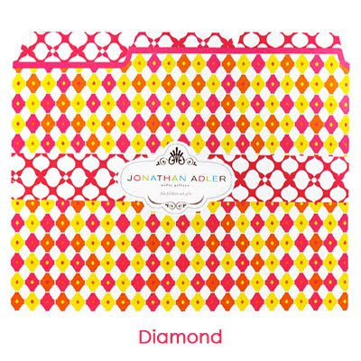
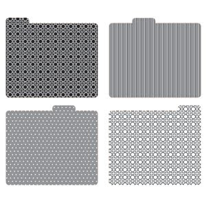
Pretty file folders for your home office makes paying the bills and filing away paperwork so much more fun. I have these nice graphic folders above I purchased from http://www.seejanework.com/ in my studio that I've used for two years and I love them. I'm one of those people who needs to keep things out on their desk and within view to be able to remember everything! I keep them in file stands right in front of me. If I have to look at file folders on my desk all day, they'd better not be manilla!

I was in Houston this past week and stepped in to Avalon, a stationer's shop on Westheimer. They have lots of pretty Vera Bradley products that would be great in your home office.
I love these folders. I used to think of Vera Bradley patterns as a little French country and kind of cutesy, but I think these are graphic and more modern looking.


Here are some more great patterns from http://www.seejanework.com/ . Back when I purchased from them two years ago, that damask pattern was about all they had to choose from. You should see the selection now. It's like walking into a fabric showroom.

Semikolon


Thomas Paul

Jonathan Adler


Galison


Cute pencils. Wouldn't these look nice in a chunky white mug by the phone?


Now for some of my favorite tools of the trade....products I use in my studio that I love and that work really well!


Storage bins from Container Store. These are the BEST! They are lightweight but extremely heavy duty. I use these for projects and put my pretty folders with paperwork in them and throw tile and fabric samples in there too. I could not work without these to organize my projects.
Nice that you can see what's in there! They are only $3-$5.00 too!


Since I do love my shelter mags, I am always looking for great ways to store them. I have used these from Container Store for years, they are always still available.

You can't see this photo very well, but these poly project file holders from Office Depot are the best thing to keep me organized for the day. I can see through them, they are sturdy and flexible. I put paperwork, drawings, sometimes fabric or paint samples, whatever I need for the day in one place.


My favorite drawing pen! They are a little hard to find in stores, but I order them in boxes online from Office Depot.


The smaller, finer tipped version. I've used this felt tip since I was fresh out of college back in the 80's. When something stays around this long, you know it's a great product. I do drawings like these below with these pens.


I use a regular black sharpie to do the heavy lines.


Moulding detail sketch


These pens are so fun to draw with.


I love these Prismacolor artmarkers. Again, I've used these since college. They're blendable and much like watercolor on a felt tip. They're great to lay down some color fast on a drawing. Of course, in order to have the right color to match the materials in your room, you must have a broad selection to choose from at hand. I have way over 100 of these markers. Love them!


They help provide a quick way to show how color looks in a room.


There's all kinds of techniques to get the color to look like a certain material, like the mosaic above. I can do more refined renderings and spend a lot of time on them, but mostly they are rather quick studies.


Even if just doing neutrals, it helps for people to see where the contrast is in the room.


I know I could do these on CAD or many other computer programs. The younger generation can have those. I'm determined to keep drawing, it's the way I trained my brain to design. My interns provide the CAD skills my business needs for turning out more exact drawings.

Do you have a favorite writing instrument that you use everyday and always make sure you have on hand or is it all keyboard or touch screen? Will we even be using file folders in 10 years or will they only be represented with the icon on our screen? We won't need magazine holders for our e-zines. Will doing anything by hand have a place in the modern work world? I guess those are all questions we are pondering these days. I hope there is a way to blend the two. I find technology helping my business in new ways every day, but I will still do my hand drawings.


Friday, February 18, 2011

The Elephant in the Room

image from spongeist.wordpress.com
I do a lot of design for remodels......kitchens, bathrooms, etc. When I meet with homeowners for the first time, they have usually done some homework and have created a list of what areas of the space they want to affect. Sometimes I agree with their scope or choices of items to replace or redo, but sometimes due to budget constraints or a desire to minimize the remodel, they want to leave the biggest eyesore in the room and they ask me to work with it.
While I pride myself on being able to improve any project and make things work for my clients, I sometimes feel this is a bad investment of time and money for the homeowner. We are trying to make an ugly or dated or out-of-character thing look like it belongs......the elephant in the room.


image from atlasshrugs2000.typepad.com

image from amyabrahams.com

Here's a nice big elephant below. Luckily the homeowner agreed and it was OUT with this dated monster.


She got a lovely, up-to-date bathroom with a free standing tub and beautiful stone floor. Yes, it was a big remodel, but it definitely made a big impact. Would you have been happy keeping that large sea of cultured marble in your freshly remodeled bathroom?


The elephant in this remodel above was the builder grade, ceramic tile floor that was all over the kitchen, living room, and long entry hall. It was cold and uninviting, no matter how many rugs you threw on it. The kitchen cabinets were a given, the homeowner wanted a warm, inviting look and liked the cabinet color. The big question was what to do about all that tile. It didn't enhance the look of the wood cabinets or get her the warm look she wanted. Luckily, they bit the bullet and changed the floor to a beautiful slate that complimented the cabinet color and upgraded the look of the whole house.


Much better, right? We warmed up all the finishes to work with the one existing thing we wanted and had to keep, the cabinets.


Before
After


Before - Entry Hall


After - Entry Hall


If you are thinking about remodeling, you should stop and consider these things.
  1. How long do you plan to be in this house? (Remember, most people stay longer than they intend!)
  2. What is the condition of the items in the space to be remodeled? Are they functioning properly? Are the yellowed, cracked, stained?
  3. Is your tub sunken? (Okay, personal pet peeve.)
  4. Are you leaving builder-grade products in the space because they are in "okay" condition? If all other products are upgraded, that one might scream, "You left me here to annoy you!"
  5. Is this something you really hate and it bothers you, but it would be so expensive to replace so you are leaving it anyway?
If you've answered yes to any of these questions, you should carefully consider the scope of your project, even if it means holding off for a while until you can do what you want. Just remember, you don't want to have any regrets after you've finished with all the mess, disruption, and expense.

One last thing.....in this economy, the much chanted myth of getting what you put into the house back out of it when you sell is no longer a given.....period. Just give up on that for now. These days you're doing a remodel because you want to live in it and use it and your home will give you much satisfaction in the years to come. Updating for resale is a totally different animal. :)


If you need help with your elephant in the room, contact Aston Design Studio for a consultation!


I think this is sort of an HGTV get-your-house-ready-to-sell approach to design. You are just sort of making do, making the best of what you have, making it look so much better than it DID, etc., but it may not really be giving you the end result you want. If you are planning to spend a certain amount of money on a master bath remodel and due to the limitations of the budget, you have to leave the dated, yellowed tub because tubs are expensive purchases in a bath remodel, then the tub has become your elephant. No matter what you spend on the remodel, that tub will still be there, telling everyone what year it was installed and that you didn't have the money or the insight to tear it out when you installed your beautiful new shower or vanity.
I'm all for making existing things work when you can. I've worked with many an existing tub, existing cabinets, existing tile floors, etc., and it definitely can be done and can be done well. I'm not arguing that. I just think it's important for homeowners to ask themselves this, "Will I be happy a year down the road, after this process is over, with that item remaining in my new space?"
It's a hard decision, but sometimes it's better to wait and save until you can redo the whole space the way you want rather than go half-way. Then when you are ready to go for it, you can wholeheartedly plunge ahead without many fixed variables and you can really get the look you want.


Any designer will tell you this is the most difficult of all challenges. The more fixed variables you have to work with, the more limited you are with what your solution or design will be. For example, if you have all your furniture, paint, window treatments, etc. and are looking for the perfect rug to tie it all together, you've really got a struggle ahead of you. You've limited your choices by having so many of the variables fixed. But that's beside the point. An elephant will always be an elephant no matter how you disguise it.

Friday, February 11, 2011

Showhouse Bathroom

"Phoebe".....my imaginary client. (photo ripped from the Urban Outfitters catalog)


I'm very excited to be working on a bedroom and bath for the upcoming ASID Showhouse in Sienna Plantation. I have an imaginary client, an older teenaged girl, "Phoebe" I'm calling her, recent grad of the local high school, attending college now and just coming home for holidays and summer. She is a free spirit, loves music, theater, photography......definitely artistic. She's smart and knows her own mind. She and her mother butt heads from time to time, both are headstrong and like to get their own way. You know, the apple doesn't fall far from the tree! She's very opinionated about her style which is eclectic and bohemian...she likes what she likes and is a bit unpredictable when it comes to clothing, hair, make-up, and her room. She mixes it up and likes adventurous combinations.


I'm still tweaking the bedroom, the "she-cave", but the bathroom is under construction so all design is finished in there. It went a bit more on the feminine side than her bedroom, after all "Mom" had something to say about this and still envisions her sweet little Phoebe washing her face in that bathroom at night, ready to be tucked into bed.


I received the wallpaper last week. It's beautiful, feminine, and graphic...bright apple green background with silver and white, in this enlarged pattern. I wanted something bold that Phoebe would have fallen in love with and had to have in her bathroom. All other finishes and fixtures are nice, but play a supporting role in this space. It's all about the wallpaper.


Seabrook wallpaper, with silver metallic highlights, through Wallcoverings, Int'l.


Elevation of the vanity area.


Floor tile is a Daltile product, Fabrique, 12" x 24", laid in a brick pattern. It's a rather modern look porcelain, made a bit more traditional with the pattern. The grayish color works well with the silver metallic in the wallpaper.


White Daltile Rittenhouse subway tile for the shower/tub area, repeating the brick pattern and not calling much attention to itself. Clean, functional, supporting role, classic look.

A little sparkle....the Visual Comfort ceiling mount fixture from Circa Lighting.


Beautiful, sophisticated wall sconces... silk shades, modern lines, softness at the mirror. Visual Comfort through Circa Lighting.


Modern mirror with a little more metallic. I love that the pattern of ovals is the same as the brick pattern on the floor and wall tile. Custom made through Unique Arts of Houston. Countertop material shown above is a Silestone product, Blanco Maple, white with some gray flecks.

Kohler Margaux faucet and plumbing fixtures in polished nickel. I love the squared off shape, a little different, just like Phoebe. It contrasts with the fluidity of the wallpaper.


Cabinet color - Sherwin Williams, Sassy Green - perfect name.


Cabinet door hardware, modern, lucite...definitely Phoebe's choice.


My concept board presented back in December.

I think this will make her happy to get up in the morning. It's fresh and not too young. Mother and Daughter will love it. Finally, agreement on something!


If you would like help creating a bathroom tailor made for you, contact Aston Design Studio today!