Showing posts with label design observations. Show all posts

Wednesday, January 4, 2012

Pick Something

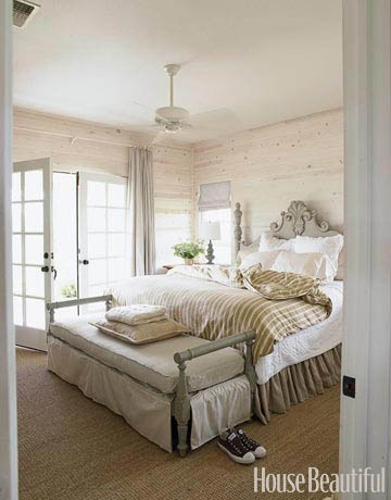
Some of the most successful interiors are developed by selecting one major element in a space and making it the star.  Everything else in the room plays a supporting role, remaining visually quiet. Like a choir with a soloist, a cast of actors in a movie with it's lead character, or a ballet troupe with a prima ballerina, not everyone or everything can shine all at once.  The more quiet the supporting parts, the more dramatic the outcome will be.


Ceiling - no showstopping, sculptural furnishings or colorful fabrics here....just that amazing ceiling.


Color - so rich you want to just wrap yourself up in it.


Pattern - the bed is almost non-existent, everything else plain.


Art - so dramatic, nothing else competes.


Vessel sink - with support from vanity top and walls.


Wall finish - the banquette is so neutral and unassuming by comparison.


Marble - details and cabinetry are all so simple.


Wallpaper - nothing else pretends to compete.


Sometimes it's best not to overwork everything in a space.  Let one thing stand alone and appreciate the plain-ness of the rest.


Image credits:  Robin Bell - House Beautiful, Eric Lysdahl - House Beautiful, Windsor Smith - House Beautiful, Alberto Pinto - Architectural Digest, Carla Aston - Aston Design Studio, Alessandra Branca - Southern Accents, David Kleinberg - Architectural Digest, Amanda Nesbit - House Beautiful

Sunday, October 2, 2011

Same Color Walls and Mouldings


Suzanne Kasler, Kim Winkler - House Beautiful

Using the same color on walls and mouldings in interiors can be effective in doing many things.  Most importantly, it makes the lines or bands of contrast go away and a stronger, bolder, somewhat more contemporary look emerges.  Where contrasting moulding might have visually divided up the space above, it is now unified with one color statement.  Those beautiful, rich wood doors really stand out in this single color space.


Gwen Driscoll - Elle Decor

The graceful lines of the furniture and rich color in the artwork stand out in this interior.  The same color treament updates and modernizes the traditional furnishings.


Kay Douglass - House Beautiful

Painting the wall mouldings and door the same color as the walls simplifies the look in this dining room. The texture of the ceiling is allowed to be the star.


Barry Dixon - Traditional Home

The colorful artwork really stands out on the wall with mouldings subdued by a same color treatment.  


Barry Dixon - Traditional Home

The intricate carving in the mouldings above is actually more pronounced.  If they had been painted a contrasting color you would have noticed the banding or lines of the moulding, not the detail of the carving.


Barbara Westbrook - House Beautiful

Here the same color on the mouldings gives a bigger impact to the overall design.  That smokiness and romantic quality would have been destroyed with the crispness of white mouldings.


Elaine Griffin - Elle Decor

This color makes a bolder statement painted on walls, baseboards, and window trim and shutters.


Robert Goodwin - House Beautiful

The gilded antiques above are set against a simple backdrop that is not fussed with a contrasting moulding.


Kay Douglass - Veranda

Just gorgeous.  A simplified, modernized version of a traditional dining room.  It doesn't forget it's past, but is such a creative and dramatic reinvention.

While not appropriate in every situation, the same color used on walls, mouldings, and doors can add an updated, bolder look to a room.  The lines running around the room or "outlining" disappears and color envelopes the space.  The objects in the room become more visually pronounced and emphasized. What a great tool for instantly changing the look or feel in a room!


Thursday, September 22, 2011

Repetition in Design


Jacqueline Derry Segura - House Beautiful

Repetition is one of the tools used in design to reinforce a concept.  It helps provide continuity, aids in making a statement, and celebrates that one element that is worth repeating. 

Color is one of the most common elements repeated in design.  In the bedroom above, the gorgeous citron color is repeated in the ottomans, lamps, headboard, and art.  A fresh, vibrant mood is created because of the repetition of that color.


Chantal Dussouchaud - House Beautiful

In this image, the map motif or theme is repeated.  It reinforces a global, traveled feel in the space.


Miles Redd - Elle Decor

The curvy silhouettes of the chairs, sofa, and window treatments repeated here evoke a feminine quality in this room.  The lipstick red color also contributes to that look, repeated as well.


Mark Cunningham - Elle Decor

The boxy shapes in the chairs, cocktail table, and window make a strong style statement of a masculine, almost business-like interior.


Laura Kirar - House Beautiful

These rectangular mirrors repeat the window shape and make for tall, linear look. It sort of celebrates the narrow window which could have been a negative at a bathroom vanity.


Tom Sheerer - House Beautiful

The repetition of bold patterns makes for a playful, interesting space. 


Dan Marty - House Beautiful

I love the textural interest repeated here in the rug, chair backs, and baskets.  It reinforces a casual, relaxed ambience.

In all these examples, the repetition of certain features helps strengthen the overall design intent.


In this accessible bathroom design I did for a client, a linear, horizontal line was repeated in plumbing fixtures, lighting, hardware, mouldings, and louvered doors.  A masculine, spa-like ambience was desired and the horizontal lines help create that feel in the space.


In this kitchen remodel, copper was used repeatedly to bring a French country look to the space.  Copper cabinet pulls, sink, faucet, and accessories helped make a statement.


I love the use of copper here.  It was just the right metal finish to compliment the soft color scheme.


Repetition in design is great for emphasis and I love to see it used successfully.

Friday, August 26, 2011

Curvy Shapes in Interiors


Amelia Handegan - Southern Accents


I love seeing a visual statement in an interior and nothing does it quite like a curvy shape. Let's face it, rooms are mostly boxy, maybe even angular. Applying curves gives an organic feel or human touch to a space. Statement curvy shapes can give quite an amazing and dramatic visual effect. I love some of these examples.


Antonello Radi - Elle Decor


Alex Papachristidis - House Beautiful


Steven Shubel - House Beautiful


Berkley Vallone, Caroline DeCesar - House Beautiful


Bunny Williams - Elle Decor


Cathy Kincaid - House Beautiful


Amy Bergman - Traditional Home


Hattie Wolf, Abby Rizor - House Beautiful

I love the marble backsplash behind the tub in the bathroom beyond.


Jay Jeffers - House Beautiful

Curvy headboards are sculptural and provide beautiful silhouettes.


One of my bathroom remodels

I love curvy marble backsplashes. They have a historical reference and add a custom look to a vanity.

Apartment project photos are coming soon. It's my daughter's college apt.  So cute and filled with some of my Showhouse furnishings. 

Have a great weekend!  I'm working!


Thursday, August 11, 2011

Window Treatments - Part 2, Blending with the Walls


Back to discussing window treatments! Window treatments that blend with the walls have a softening effect on a room.  Whether it's panels, valances, or shades, treatments of the same color or tone as the walls don't call attention to themselves.  Particularly in a light room, I think they have a way of attracting your eye to the view and not stopping your eye at the window.

The space above was a butler's pantry I did in a Showhouse in 2008 here in The Woodlands.  This home was located in the Garden District of this area and I wanted to relate it to the gardens outside. You see how the walls and Roman shade blend together to create a soft look and the lush garden is quite apparent.  The window treatment doesn't compete with the view.


Here's another project of mine where the sheer panels blend with the walls and envelope of the room, softening the bedroom and not competing with that beautiful view.  Your eye looks right through those window treatments.


These beautiful patterned sheers with a rope trim provide a gauzy, romantic softness at the French doors in my recent Showhouse room. They're kind of like an invitation to step out on to the balcony.

There are many other designers who also use this tool very successfully.


Martin Lawrence Bullard - Elle Decor


Ellen O'Neill - House Beautiful


Emily Robison - Elle Decor


Tracery Interiors - House Beautiful


Tobi Fairley


Kate McIntyer and Brad Huntzinger - Traditional Home


Elle Decor


Jason Bell - House Beautiful


Ginger Barber - House Beautiful


Frank Delledonne - House Beautiful

In dark rooms, same color window treatments also give a romantic, soft feel.  They sort of turn the room in on itself and have a cocooning affect.


Elle Decor


Nancy Price - House Beautiful


Alessandra Branca - House Beautiful


David Mann - House Beautiful

This is a great NYC view. Imagine if the designer had used some contrasting, colorful panels at the window instead of the same smoky gray.  It would've stopped your eye and not felt nearly as romantic.

Window treatments can add such personality to a room.  Next window treatment post will be about pattern at the windows!  Have a great weekend everyone.  I'm moving my daughter back to her college apartment.  Fun!