Tuesday, November 30, 2010

Redo Simply

I recently finished this remodel where the homeowner wanted an update in her kitchen and family room. This is a typical remodel request in this area, new countertops, appliances, paint, backsplash, lighting, hardware at a minimal cost but with a big impact. I think we hit the nail on the head with a dramatic change and a more sophisticated look within the confines of the budget. After photo above.

Here's the before photo. The older white appliances had to go as did the tile backsplash and counters. We kept the existing cabinets and stained them and kept the tile floor. The homeowners wanted a darker, cherry stained finish for their cabinetry for a richer look.
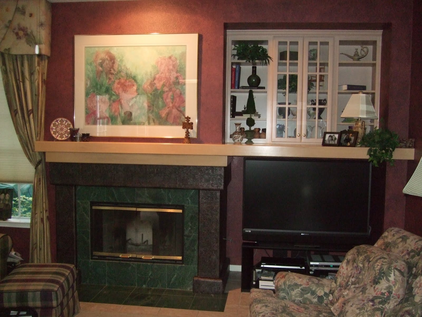
The photo above was their existing fireplace wall, directly across from the kitchen. I thought it was just too busy and appeared as a sort of quad diagram, everything divided up in sections, with too many colors and finishes. Something needed to stand out and become a focal point, the fireplace!


Here is the after photo, much neater, tidier, and visually cleaned up. The fireplace has more prominence and the room appears cozy and comfortable. The built-in on the right of the fp was minimized with paint to match the wall with only shelving that contrasts. The long mantel that divided the wall in half was eliminated and a proper mantel stained to match the kitchen was installed. Tile surrounding the fp was changed out to a granite tile that matched the mantel in color. The tv was mounted above the fp instead of pushed back into the far corner as before. We reupholstered the existing seating and did a new textural rug to further enhance the rich look.


I love simplifying spaces so that beautiful features can then be noticed. Visual clutter and too many colors and accessories just create busy, uncomfortable environments. If you unite different features in a room with color or finish, you can make them bolder and more striking. I love how this project turned out, a much calmer and more sophisticated space.

Fabric on the chairs from Duralee, rug through Aston Design Studio. Granite is Crema Bordeaux from Arizona Tile, tile from Daltile, paint is Sherwin Williams, Latte. Photography by Cathi Taraboi Photography.

Monday, November 29, 2010

NYC's Window Displays


’Tis the Season for Holiday Window Displays

I just had to share this peek at New York's fabulous window displays. I can't visit NY myself, so it's so nice to have this look via NY Magazine to get us in the spirit. My personal favorites are a tie between Bergdorf Goodman's and the foodie themed ones at Barney's. I also love the Saks windows with the vibrant color and art nouveau inspired cabinetry. They are all beautiful and such a wonderful NY tradition! Now this gets me in the spirit of Christmas!

Sunday, November 21, 2010

Eye Candy!


At the Houston Dec Center last week, Marjorie Skouras, designer of these exquisite products, was featured in a panel discussion. These chandeliers are absolutely beautiful and are seen in luxury interiors all over the world! The chandelier above is turquoise and coral. Such a simple shape but with eye popping color and richness!
She does it in many different types of stones. This one is blue quartz.


Yummy! Pink jade!

Black onyx....so dramatic!


The Bruno chandelier. What a nice way to bring in a natural element into your space!


This coral mirror is on display in the Courtney and Co. showroom in the Houston Dec Center.
Another turquoise chandelier!


A rock crystal mirror. Mirror, mirror on the wall....I think I would be the fairest of all if I had this mirror!


She is doing cabinet pulls out of beautiful stones and coral now. Truly jewelry for the home.


A little red coral is a lovely way to bring color and nature into your interior! Beautiful products for beautiful interiors. For more on Marjorie Skouras, check out her website: www.marjorieskourasdesign.com


Sunday, October 24, 2010

My Building Lobby is Complete!

The furnishings I had custom made for my building lobby are installed and I think they look beautiful! Everyone in the building has commented favorably and I love that I can put my cards out there. Since this is right outside my studio door, I felt I should have a presence. The furniture piece below was placed there first by my landlord........

Well, I had to get involved! I didn't want my clients to think I had done that. (Sorry if I'm offending my landlord! I love it here! :))


My carpenter built the console to my specifications, then my faux finisher did a lovely job finishing it for me. The lamp is from Aidan Gray and the mirror, custom as well. It reflects the light from the window directly across the lobby.


This is definitely more "Aston Design Studio".


Saturday, October 16, 2010

Sketches


There has been some discussion lately by designers about the preference of sketching or hand drawing vs. CAD drawing. As a designer, one of the best ways to show a client your ideas is to provide drawings. We are taught in school and many of us use drawings as a way to think through a design and develop concepts. These days, both methods are taught, but the age of the interior designer has a little something to do with their preference. :) We didn't have CAD when I went to school! I enjoy sketching up my projects and will lay color down as well to help a client visualize their space. It's usually part of the schematic design phase of the process. I do have a younger assistant who prefers CAD, which is undeniably the best method for handling revisions. However, in this day and age of all things computer generated, I find my clients really appreciate my hand drawings. Sort of like a hand written thank you note vs. an e-mail sent from your phone, it's just more personal. I thought I'd share some of the drawings that I've done on various, unrelated projects.


Some drawings are done in elevation, some as a floor plan, others are a perspective sketch.

Elevation of a girl's bedroom showing a new window seat and shade.

Perspective sketch of a living room to show architectural features and tile layout.


In this sketch for a kitchen remodel, new finishes and a new pantry door were highlighted.


This elevation sketch shows how the color on the wall, hood, backsplash, and counter will blend together to break up the wall of white cabinets.


The master bath above is being remodeled now. I can't wait to see it finished! The tub is absolutely beautiful!


This furniture layout visually shows how the color is balanced around the room.


A drawing like this shows how all the elements and details work together to make a certain visual statement.


I like to label up my drawings with notes, so that my clients can refer back to them and remember what I tell them at the presentation.


Drawing is one of my favorite things to do as a designer. I prefer it to shopping!


Friday, October 1, 2010

Pink Peonies


Pink peonies........for my sweet, strong sister who is a breast cancer survivor!

Monday, September 27, 2010

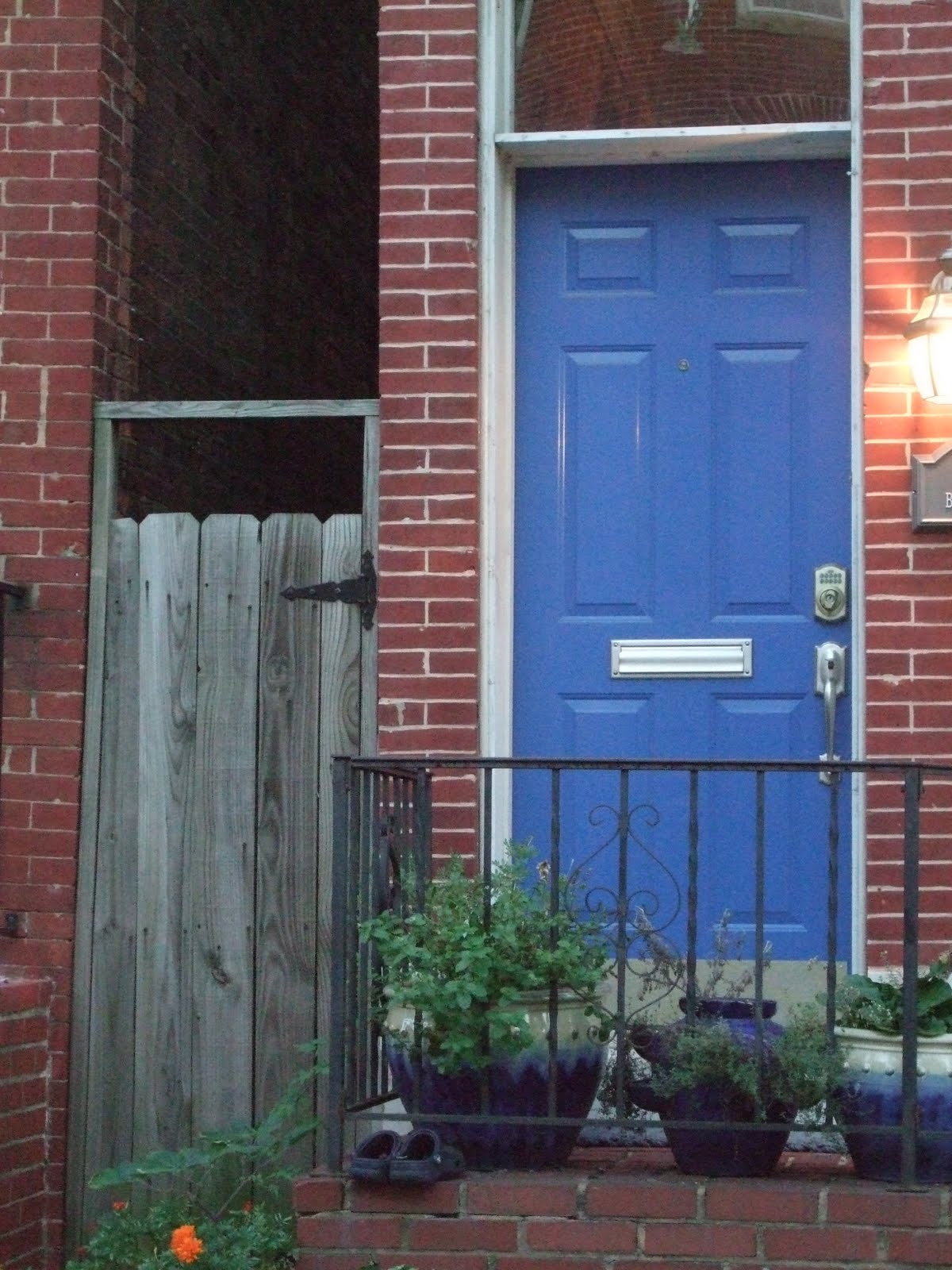
Front Doors - A window to your style

Front doors often provide a peek into the personality of the homeowner. I love the bright color on this front door above.
On my recent trip to Baltimore, I loved snapping photos of some of the front doors on the row houses in some of the old neighborhoods. Although row houses are found in many cities, Baltimore has more than most. The blocks just go on and on with plain brick or stone block on the facade like this photo above and below.
Not too exciting? Many of these homeowners seem to like to use their front door to show off their personality and style. Color, extra mouldings, a few pots of flowers, some beautiful hardware......that's all that's needed to provide a little punch.


I love blue....this is charming!


Such a nice substantial welcome. The black is such a great contrast to the brick.


Interesting multicolor combination. Beautiful and unique!


Lovely stained wood doors in cast stone surrounds.


Two different color schemes on similar doors. Both very different and both have lots of personality.


I love this orange door with the stained glass in the windows.


Another blue with a cute window box!


Love the knocker!


I think behind this door a party awaits!

What kind of statement have you made with your front door?