Monday, June 20, 2011

The Adaptable Parsons Table


It all started with this. 
 Thomas Jayne's work in Architectural Digest


Then in the same issue......Amelia Handegan.  Same type table, very different rooms.

The simple Parsons table is one of the most adaptable.  Suitable in any type of material, in any type of environment.  A chameleon of sorts. Dress it up or down. Lacquer it, leave it in a natural wood, perhaps enliven it with a special finish, or douse it with a bold color.  It can take a back seat and allow the more ornate around it to stand out or it can command all the attention with it's boxy, simple, structural form.

The Parsons table design is credited to Jean-Michel Frank from Parsons Paris School of Art and Design in the 1930's. It came out of a project from one of his courses, according to the NY Times in an article in 2006. The challenge was to create a table that despite the finish, could maintain it's integrity. 

I do believe it has.


This project featured in Lonny, is where one might expect a Parsons table to be found.  Modern, clean-lined, plain and simple next to all that pattern.


David deMatei and Patrick Wade - House Beautiful

However, it is at home in a more traditional environment. (While not a true Parsons, where the leg thickness equals the top thickness, this is an adaption of one.)

Parsons tables make great desks, coffee tables, or dining tables.


Sig Bergamin - Elle Decor


Anne-Marie Midy and Jorge Almada - Elle Decor


Jesse Carrier and Mara Miller - Elle Decor


Juan Carlos Garcia - Elle Decor


Elaine Griffin - Elle Decor

Good design is functional, timeless, adaptable, and beautiful.

Wednesday, June 15, 2011

AD Love


 Did anyone else think that this was going to be just another celebrity issue?  Not that I didn't appreciate the beautiful Elizabeth Taylor, but if you're going to claim to be the "International Design Authority" shouldn't we have some design on the cover?

I actually left it in it's plastic wrap on the breakfast room table for a week before I touched it.  That's not normal for me!  I usually delve into my mags and study and examine them until the next one comes out. When I finally opened it up, I was really blown away!  Such a wonderful combination of projects with one common theme....GOOD DESIGN!


This project by Thomas Jayne was simply stunning.  I love that blue parsons table with the antique, carved chairs and the crisp, white walls.  So unexpected for a home of this nature and yet, doesn't the combination just sing?


That table had belonged to the homeowner in mauve, Jayne had it lacquered blue. 


Look at that striped runner in this neoclassical envelope with those chairs dipped in a hot red.  Such an interesting combination and so graphically artistic. 


Then there's Amelia Handegan at the beach. Casual, graphic, comfortable, clean.  I love this project. What a contrast to Thomas Jayne's.


Great color and such a wonderful atmosphere.


The modern project - MR Architecture + Decor. Bachelor pad in NYC that has just the right amount of artful statement mixed with simply detailed materials. 


What a great modern kitchen injected with just the right amount of warmth in the table and floors.


 I love this closet done in laminated plywood, simple materials shown off at their best in a natural state.


A fabulous hotel on the Amalfi coast, Villa Tre Ville, exquisitely designed.  AD is international, you know!


I'm not sure I'd leave the room!


Then they top it off with a peek at some of the most unique architectural projects around the world.


I'm so satisfied.  I'll be pouring over this one for a long time.


All images from the July 2011 issue of Architectural Digest.

Friday, June 10, 2011

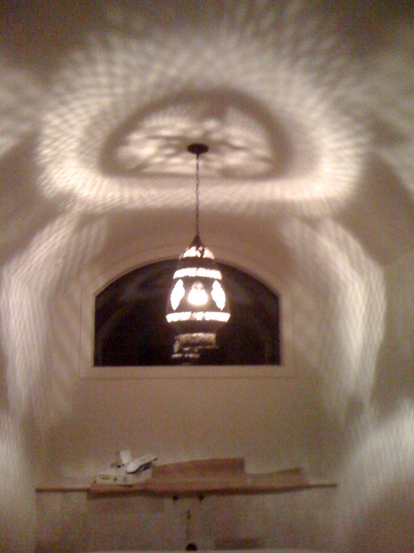
Patterns of Light


It's not really about that orb floating inside the groin vault in this hotel in Marakech, is it?  It's about that exquisite pattern of light that the orb creates.  Magical.

Circa Lighting Blog - the shadows here align with the vaults in the ceiling

Selecting lighting for a space involves so many considerations.  How much wattage needs to come from a fixture? What type of bulbs?  What direction does it need to illuminate? How does it scale in the room?  What material and finish is best for the space? What about style?  These are just a few of the things designers have to consider when selecting lighting for a project. 

Zamzam Riad Boutique Hotel

Sometimes the pattern of light created by the fixture is an afterthought.....a reward after the fixture is installed.  Many times there is no way to see the fixture lit beforehand. There may not be a photograph of it lit and choosing one that is in stock and installed in a local showroom for a client to see live and in person is rare. So, when the fixture is flicked on just after it's installed and we're all looking up with an expectant smile, hoping it will do everything it's supposed to, and then.....


My bathroom fixture - Circa Lighting

I LOVE this moment.  The pattern of light created in that particular environment is always unique.  Color, texture, and objects in the room are all affected in a different way.


Zamzam Riad Boutique Hotel


Sconce by Two Hills Studio, Austin, TX


Sorry for the glare here, my job site photo!  Love the pattern on the ceiling though.


Very blurry shot of one of my master bath remodels in progress.  Moroccan fixture installed. I'll post the final shot soon!


Another Zamzam Riad photo - beautiful!

Patterns of light in a room add another layer to the overall depth and richness of a space.  It's not always about the beautiful fixture, but about the way it brings everything to life!

Friday, June 3, 2011

Kitchen Cabinets to the Ceiling

Darryl Carter - Elle Decor

 I'm loving upper kitchen cabinets taken all the way to the ceiling.

It appears to be popular!


 Christopher Peacock - Traditional Home


 Nate Berkus - Elle Decor


 Nancy Boszhardt - House Beautiful


 Kay Douglas - House Beautiful

Whether your ceilings are high or low or if you have a traditional or modern style, it is a great look and gets rid of that dust catcher shelf that people always feel like they have to decorate.


 Meg Braff - House Beautiful


Joe D'Usro - Elle Decor


Jay Jeffers - House Beautiful


This is a before photo of a kitchen remodel I've recently been working on.  10 ft. ceilings and a typical upper cabinet height.  It makes the space look very horizontal and monotonous.  Mostly, it brings the ceiling down.  The homeowner wanted a new white kitchen, but loves the bit of wall color above the cabinets and needed display space for ceramics.


Here's what I proposed.  Cabinets to the 10 ft. ceiling, with color inside and a painted sheetrock hood that would make a more dynamic color statement than a strip above the cabinets.  I think it adds height to the room and gives a strong focal point to the kitchen.  Can't wait to see the end result!

If you have a design related question or need some advice on any aspect of interior design, e-mail me HERE. I might feature your question in a special Q and A blog post!

If you need a fabulous new kitchen design, contact Aston Design Studio to start the process!

Wednesday, June 1, 2011

One More Bathroom Remodel


I have one more master bath remodel to share. This bath went from the builder standard to a simple, clean-lined retreat. The squared off shape of the plumbing fixtures, hardware, and linen weave patterned porcelain tile provide a bit of a modern touch. We enlarged the shower back into the closet and cleaned up the details.


Shower before was a tiny box.


 Builder "details" like the sheetrock shelves or indentations at the ceiling were cleaned up. These were about 12" high and served no purpose. Here's a hint....the more you chop up a space visually, the smaller it looks!


 Dated lighting and mirror went out.  We kept the cabinets and tub only.


Another hint....everything painted the same color makes a space seem bigger!  You don't see the ends of the planes.  The whole space just visually opens up.  It also hides details you want to minimize like the traditional paneled doors and medicine cabinet.  The color we chose for the tile and paint worked well with the rest of the house.


Such meticulous tile work.  When you have a modern look and the detailing is very clean, the craftsmanship has to be the BEST.  Look at that bullnosing and how everything lines up perfectly with such small grout joints.  :)


When I was a little girl, I never dreamed a perfect tile job would make me so happy, but it does!


I love the texture in the woven shade that was repeated on the cabinet.  The rain shower is such a nice luxury.  Simple, modern, spa-like.


"After" photos by Miro Dvorscak
Contact Aston Design Studio for a beautiful, spa-like look for your bathroom remodel!