Friday, November 25, 2011

Circa Lighting Blog


I'm so excited to share some news.  One of my projects is featured today on the Circa Lighting blog.  Check it out HERE.  Circa is my go-to source for beautiful, exquisitely crafted lighting.  I use a lot of Visual Comfort lighting and they are the best resource for those products.


I used this Simple Scallop pendant in my showhouse bedroom.


I love the shape and softness it gave the room.


In the bathroom, I used the simple scallop sconces and a little sparkle on the ceiling to add some femininity.


Simple scallop sconce

Paris flea market ceiling mount


In this bathroom remodel project I used the lighting to add some detail and elegance. 


Reed 8-light chandelier


Siena 3-light sconce


The Channing single sconce was used the this master bath remodel.


I love their antique rubbed brass finish.  It has so much depth and a beautiful lustre.


The simple, slender shape of this sconce was so appropriate for this small powder bath.


tt single arm sconce in bronze


I used the medium Eugene in my old office space.  I've still got it, to use in my upcoming kitchen remodel.


Great resources are a must for every designer.  Circa has a beautiful lighting boutique in Houston so you can see fixtures and finishes in person.  I have a great rep that keeps me updated with information and service.  Circa has become a wonderful resource for me.

Thursday, November 24, 2011

Happy Thanksgiving!


My Thanksgiving table

I've been so busy I did not have the energy to iron linen tablecloths last night, so I threw a roll of burlap on my table and set it with my assortment of creamware and some blue pumpkins.  I really love the contrast of rustic and refined on a table. 


My table last year was a bit more refined.  But I do something different for every dinner party.


Now on to finish off all the food that will fill these plates!


I'm so thankful for my family, friends, career, and this wonderful country where we can pursue our dreams freely and without restraint.  I hope you all have a lovely and tasty Thanksgiving!  

Sunday, November 20, 2011

Ombre


Ombre  - n. A French term meaning "shaded." Usually a multicolored stripe, with colors graduating from light to dark. The color effect is woven into the fabric. Generally produced by arranging different tones in the warp.      definition from fabsugar.com

It seems to be a popular pattern these days for hair dyeing....


for wedding cakes.....


and in fashion.


A little ombre for the home too.


Vera Wang bedding


TransOcean rugs


Anthropologie


marthastewart.com 

 
natty by design blog


Rosemary Hallgarten alpaca throw


Mark Rothko


I'm loving a little ombre, sort of a celebration of color!


Friday, November 18, 2011

More Project Photos

After - Living Room

More before and after photos of my remodel project today.  I posted previously HERE and HERE about this job.


Before - Living Room 

That big chunky crown at the window really bugged me. It divided the view in half. I also didn't care for that wide flat board surrounding the arch. Simpler, smaller mouldings painted the color of the walls take your eye right out the window to the view beyond.

After - Fireplace

We kept the fireplace surround and had it finished to be similar in color to the walls.  (It was mauve before!) Adding a new, distressed wood mantel in a color and finish to match the floor brings the wood element up into the room and makes for a beefier mantel. Now she can actually put something on the mantel without worrying about it falling off.


Before - Living Room Fireplace

We removed those sconces beside the fireplace.  The homeowner really wanted to hang her art and there wasn't much wall space in this house!  The wood floors made such a tremendous difference in the feel of this house.  The warm white on all the walls, ceilings, and mouldings freshened everything up.


After - hallway

New wood doors and bronze hardware were added.


Before - hallway


After - Master Bath


Limestone on the floor and counter introduces some nice texture in the bath.  Kept the details very simple here.  The statement is coming.


Before - Master Bath


After - Tub

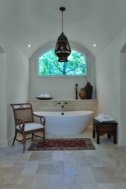
Directly across from the entrance....the beautiful, sculptural tub with an exotic pendant.  We had plenty of room for the limestone ledge behind the tub after tearing out the large cultured marble surround.  The curve of the ceiling is repeated in the tub and the bulbous shape of the old Moroccan fixture. You should see the pattern of light it creates at night.


Before - Tub

Excess mouldings and columns were removed to reveal the nice bones of the room.....a soft, curve to the ceiling and a roomy bathing alcove.


Now for the special place for the cats!


Before - the unused knee space


After - Kitty litter box is enclosed in the cabinet

The cats have their opening to pass in and out through the wall.  Just open the cabinet doors and remove the litter tray for cleaning!


Lots of nice little visual moments in this house.  I'm so happy to add this one to the portfolio!


Many thanks to Susan Fox of Love Where You Live blog for featuring a recent bathroom reno project!  Susan is a field editor for Meredith Publishing and she does such a great job describing design work.  Please check it out!

Tuesday, November 15, 2011

Project Reveal

After - Kitchen

Some of my photos are complete on this remodel project.  I still have another photo day to schedule in, but I thought I'd share a few of the areas today.  I've got before and afters of the kitchen and family room. 

Before - Kitchen

I shared a bit about this project HERE in a previous post.  The homeowner had all of the furnishings, art, rugs, etc. and I was challenged to remodel the home to feature all of her wonderful things and show them off in their best light.  She wanted the same warm, comfortable feel that many of her antiques and collected pieces possessed.  As an artist, working in textile and jewelry design, she has quite an eye for detail and most of her things had been acquired while living overseas in Pakistan and Kazakstan.  She has collected the things she loves..... antique textiles, beadwork, woven tapestries, and rugs.

The house was built in the early 90's and the whole thing was mauve, paint, tile, counters, exterior, everything, except for the cabinets which had turned orange over the years.  She definitely wanted a warmer, more rustic feel.  New wood floors throughout warmed up the space as did the warm white paint color that was used on everything, walls, ceiling, mouldings, and cabinetry.  I wanted a gallery-like backdrop for her colorful, textural pieces and the wood floor grounded everything.

After - Kitchen

The kitchen was very dated, with an oddly shaped island. I wanted to get rid of the raised bar counter. It served to divide the kitchen and felt like one side was a corridor and the other the kitchen. With the island at one level, it encourages everyone to come to the center "table". We kept the perimeter cabinets and painted them the color of the envelope to minimize them and draw attention to the new, beautiful wood island.  The antiqued limestone counter on the island has an interesting texture with fossils and shells embedded and just feels wonderful to the touch.  Those slabs came from MCA in Houston and they are called coral reef. The bone limestone backsplash, material also from MCA, blends with the envelope and repeats the material.  I love the way the Visual Comfort Goodman hanging lamps punctuate the light colored space with their simple shape.  We purchased those through Circa in Houston. The Rohl faucets add so much to the kitchen too.  They're in the Tuscan brass finish, a living finish, that will age over time. 


After - Kitchen


Before - Kitchen island


Before - Island

It was definitely time to remodel.  Could the finishes be any more dated??


After - Family Room

This is the family room, beyond the kitchen.  You can really see her collections here. That suzani tapestry is an antique and she's had it for years.  She didn't do this because it was trendy!

We continued all the finishes in to this space and ripped out the old entertainment center built-in.  I felt it needed the richness of the wood here, so the floor material came up on the wall and provided a stopping place for your eye.  The wood grille panels in the cabinet doors were custom made to repeat some of the texture in the room.


Family Room Entertainment Center


Before - Family Room

Check out the grillework on the cabinet doors below.  Great for airflow to the equipment inside and adds so much interest to the large built-in cabinet.


 cabinetry under construction

The counterstools were custom made, really the only new furniture item. 


I'll save the living room and master bath for another post.  The homeowner has a couple of cats that we did not ignore. You should see the special place we made for them! 

All after photos by Miro Dvorscak