Wednesday, August 31, 2011

Beautiful Project in the Works


Look at the detail on this leather upholstered table.  Gorgeous!  I'm so excited to be working on this beautiful project where we have some exquisite pieces and striking combinations.  You've seen various leather upholstered pieces recently becoming rather popular, but none were in the size and color we wanted so I went custom.


Here it is at my upholstery shop.


Using this Haute Turquoise leather from Kravet, the table will fit perfectly in front of this Kravet sofa.


The Medley sofa from Kravet.  It's on the showroom floor in Houston if you want to see it in person!  It's so sophisticated and we did it in one of their finely woven Soleil fabrics, light color like above, so all that white upholstery can be easily maintained.


They will be sitting on top of this wool zebra rug for a bold graphic look.


Very plush!


Pillows will be done in this printed linen from Schumacher.  It isn't as strong of a pattern so it doesn't compete with the rug and also ties in with the subtle, more traditional style of the home.

Just waiting for the thick glass top that will rest on the leather table.  I can't wait!


For help creating a sophisticated, custom look for your home, contact Aston Design Studio


Friday, August 26, 2011

Curvy Shapes in Interiors


Amelia Handegan - Southern Accents


I love seeing a visual statement in an interior and nothing does it quite like a curvy shape. Let's face it, rooms are mostly boxy, maybe even angular. Applying curves gives an organic feel or human touch to a space. Statement curvy shapes can give quite an amazing and dramatic visual effect. I love some of these examples.


Antonello Radi - Elle Decor


Alex Papachristidis - House Beautiful


Steven Shubel - House Beautiful


Berkley Vallone, Caroline DeCesar - House Beautiful


Bunny Williams - Elle Decor


Cathy Kincaid - House Beautiful


Amy Bergman - Traditional Home


Hattie Wolf, Abby Rizor - House Beautiful

I love the marble backsplash behind the tub in the bathroom beyond.


Jay Jeffers - House Beautiful

Curvy headboards are sculptural and provide beautiful silhouettes.


One of my bathroom remodels

I love curvy marble backsplashes. They have a historical reference and add a custom look to a vanity.

Apartment project photos are coming soon. It's my daughter's college apt.  So cute and filled with some of my Showhouse furnishings. 

Have a great weekend!  I'm working!


Thursday, August 18, 2011

Job Site Visits


Job site visits today! 
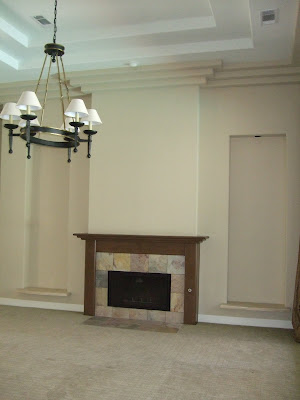
This remodel project involves turning a dated 90's contemporary property into a more traditional home.  The fireplace is coming along. 


Traditional corbels and paneling and an appropriate scale and weight for this big space helps transform the look.


Right after demo.  All mouldings and tile were removed as well as stepped sheetrock detail at the ceiling.


Fireplace Before - smallish, plain, and unimportant

On to the bathroom! 


Tile work looks great.  A warm golden color scheme was desired by my client, achieved with the Angelica travertine for flooring and bathroom tile.  Fitting a traditional tile pattern and layout around the existing modern window helps marry the styles and looks purposeful.


Shower tile work


Niche at the tub area. Waiting for the Angelica limestone ledge.

On to another job site. 

New  paint on the dark wood paneling and new wood flooring. 


Before


After - Yea!!! 

I've been soooo busy this summer, not quite on top of my blogging. Busy is good though!  I've got a fun apartment decorating project to post next.  I'll be back next week!

Thursday, August 11, 2011

Window Treatments - Part 2, Blending with the Walls


Back to discussing window treatments! Window treatments that blend with the walls have a softening effect on a room.  Whether it's panels, valances, or shades, treatments of the same color or tone as the walls don't call attention to themselves.  Particularly in a light room, I think they have a way of attracting your eye to the view and not stopping your eye at the window.

The space above was a butler's pantry I did in a Showhouse in 2008 here in The Woodlands.  This home was located in the Garden District of this area and I wanted to relate it to the gardens outside. You see how the walls and Roman shade blend together to create a soft look and the lush garden is quite apparent.  The window treatment doesn't compete with the view.


Here's another project of mine where the sheer panels blend with the walls and envelope of the room, softening the bedroom and not competing with that beautiful view.  Your eye looks right through those window treatments.


These beautiful patterned sheers with a rope trim provide a gauzy, romantic softness at the French doors in my recent Showhouse room. They're kind of like an invitation to step out on to the balcony.

There are many other designers who also use this tool very successfully.


Martin Lawrence Bullard - Elle Decor


Ellen O'Neill - House Beautiful


Emily Robison - Elle Decor


Tracery Interiors - House Beautiful


Tobi Fairley


Kate McIntyer and Brad Huntzinger - Traditional Home


Elle Decor


Jason Bell - House Beautiful


Ginger Barber - House Beautiful


Frank Delledonne - House Beautiful

In dark rooms, same color window treatments also give a romantic, soft feel.  They sort of turn the room in on itself and have a cocooning affect.


Elle Decor


Nancy Price - House Beautiful


Alessandra Branca - House Beautiful


David Mann - House Beautiful

This is a great NYC view. Imagine if the designer had used some contrasting, colorful panels at the window instead of the same smoky gray.  It would've stopped your eye and not felt nearly as romantic.

Window treatments can add such personality to a room.  Next window treatment post will be about pattern at the windows!  Have a great weekend everyone.  I'm moving my daughter back to her college apartment.  Fun!

Sunday, August 7, 2011

Pretty Vintage Porches


I worked on the design of this cute, vintage home located in a historic area of Houston a few years ago.  It had been damaged by fire and water, the fire having been caused by old electrical wiring.  The home was over 100 years old, so lots of work had to be done to update it as well as correct problems like leveling the floors, new wiring and plumbing, etc.  Finally finished for a young family, it has a cheery facade and adds value to the neighborhood.

Part of the appeal of this home are the porches.  It was so much fun to work on an exterior, something I don't do every day, but as part of being the resident aesthetician (see previous post), I became involved. 

When the homeowners came to me about this project, they showed me their exterior paint color selections and said they were happy with them. They were basically much brighter versions of what we finally did.  Think school bus yellow and baby blue. We had so much to do and since painting the exterior was about the last thing in the process, I let that slide and we forged ahead to work on kitchen, bathrooms, etc. When we finally got to the exterior, I was excited to be able have input on mouldings, trim, railings, door and window selections, and paint! 

They wanted a yellow house and I thought it was very appropriate for this type of home and this neighborhood, but we had to tone down the schoolbus color.  Then we added some punctuation and seriousness with the dark blue/gray for the trim and lighter blue/gray for the porch.  It was quite an involved process placing just the right paint colors on just the right features or mouldings. 

The railings were designed, scaled, and detailed for the contractor.


We made some decisions on site.  (See the paint samples on the wall?)


Before photo of the back porch balcony.


Back screened porch - Before


My details of the back screened porch.


Back screened porch - After

It was a long process, (there was a hurricane in the middle of all this!) but I think it turned out to be a happy looking house with some nice vintage appeal.  I think we brought the house to the place it should be. It was really a unique project for my portfolio and one I am very proud to have been involved with.

"After" photos by Miro Dvorscak.