The photos above are "after" and then "before" of the window treatments I did in the kitchen remodel shown in my previous blog post. I thought that the old valance cut the room in half and didn't involve the volume of space above it. I tried to create a more open breakfast room and accentuate the height of the ceiling by adding a chandelier and doing vertical panels alongside the windows. The trellis pattern in the fabric relates to the garden outside and the dark bronze hardware speaks to the kitchen color scheme.
Friday, December 4, 2009
Monday, November 30, 2009
A Recently Completed Kitchen Remodel
Here are "after" and then "before" photos of a kitchen remodel I recently completed. We kept some of the cabinets, replacing the doors, and did a new island and new wall of cabinetry along the frig wall. The homeowner didn’t like the white cabinets and the color scheme was very dated. A fresher, cleaner look was desired with a softer color palette. Existing floor tile remained to keep budget costs down.
I like the way it turned out with the contrast in the island, countertop, and glass front cabinet interiors. It’s a much slicker look and has a more updated appeal. I would have preferred a new darker floor, something halfway between the light and dark values to ground the space, but the homeowner preferred to keep their existing tile. It is a nice new kitchen that has added much value to the home and is much more enjoyable for the homeowners....and it doesn't look just like every other house next door! I'll post the window treatments we did in this space later in the week.
Sunday, October 4, 2009
ASID Award Winning Project
I won an award at the ASID Awards Gala last week! I had entered one of my master bath remodel projects and it won an Honorable Mention! Photos of the winning project are shown above.
My wheelchair bound client needed accessibility but did not want it to be obvious. A masculine feel with spa-like quality was desired. Walls needed to come down to provide a luxurious roll-in shower and side entry toilet. Direct access to the sinks was allowed when storage shifted to the side and the countertop was floated on the wall. A reddish toned slate, “painted desert” was used on the walls and floor to continue the exterior brick wall color into the bath and served to marry the indoor space with the garden. Dark mahogany was a rich accent and made beautiful cabinets and trim. The 3 ft. wide louvered mahogany doors added for ease of entry into the bathroom and closet, created a spa-like ambience. The glass block partitions provided some privacy while visually keeping the space open.
During the course of this project, I became interested in universal design and took a course through the GHBA to become CAPS certified. CAPS stands for Certified Aging in Place Specialist. My goal is to design projects that are accessible and beautiful.
Sunday, August 9, 2009
My assistant, Sarah, and I, at our new office!
We are ready to begin new projects. We love our new office and location and look forward to having new clients stop by and visit. Sarah Bourne has been with me now for the last three months. She is organized and technical and is a wonderful addition to Aston Design Studio. As a degreed designer and Allied Member of ASID, she recently passed her NCIDQ, the qualifying exam for state licensing of interior designers. While I sketch, she operates our CAD and we have double the skills to offer our clients. I'm very happy to have her on staff.
Saturday, August 1, 2009
My New Office!
My New Office!
Here are photos of my new office. I really love it! It’s a nice blend of commercial office with a residential softness. The industrial style light fixture and mesh office chairs combine with the soft window valances and shades, residential style of the ghost chair, and linen covered tackboards to create a nice blended look. Design offices can look so cluttered because of all the colors, samples, and paper everywhere, so I chose to have a soft creamy white backdrop on the walls and furniture. The neutral coffee colored countertops, lighting, carpet, and hardware anchor the space and provide a break in the light colored room.
The layout of the room gives the maximum use of storage and work surface and the tackboards are a must in every design office. We even have room for a future intern! Maybe in the fall.
Wednesday, July 15, 2009
Here it is, finally done!
I haven’t posted in a long time, too caught up with work and an exciting new venture I’ll discuss later. Here is the bathroom, all finished and beautiful.
I’m so happy with everything. My perfectionism served me well, everything is really just the way I want. I love my plumbing fixtures (they are so solid and function so beautifully), my mirrors (they gleam!), the tile work, the paint job (so smooth), the lighting (fabulous!), my vanity (it makes me feel so special), my storage (much improved!), and how spacious the bathroom seems now. It was a truly successful makeover. Let me know what you think!!!
My business is growing. I’ve added an employee, a young designer, who comes with good technical experience and contacts. She is very helpful.
The big news is that I’ve moved out of my home office to a business location. A local remodeling contractor contacted me last spring to talk about relocating into his showroom space. We will retain our separate businesses, but refer clients to each other. I have been doing contracting on my jobs, but I wanted to stop that and just do the design part. He wanted to farm out the design work and concentrate on the contracting – a perfect symbiotic relationship.
We are remodeling an old house on I-45 North in The Woodlands, a great location and great venue to show off what we can do. We will have a model kitchen (with a built-in cappuccino machine:), a large conference/showroom area, and sample rooms for tile, stone, and flooring selections. His wife is a faux finisher and we have many samples of her work as well. She occupies a separate painting studio in a storefront/garage building on the property. The remodeling business office is upstairs and my design studio with a nice sample room for fabrics and furniture is adjacent to the conference/showroom. I’ll post pictures soon! I’m very excited about this new endeavor!
Sunday, April 26, 2009
A New Window!
A New Window!
My new window, shown in the top two photos, has been installed in my bathroom and it is fabulous! Double pane, rain glass, installed properly to sit above the tub deck, not below it! We had rotten wood on the exterior, so it was due to be changed anyway. That cheap single pane window, shown in the bottom two photos, just did not do my bathroom justice. Nor did it insulate any being on the east wall, where we had direct sun in the morning.
You can see in the lower photos that the tile on the tub deck previously died into the glass of the window. By getting a shorter window and installing it 6” above the tub deck, I’ve created a wall for the new granite deck to die into. This window will also have a granite sill, so if a random wet washrag or soap bottle gets put on the sill, the water will not be a problem.
It has been trimmed out in wood beautifully by my carpenter, who thought to add the small crown at the top. I was considering doing an upholstered cornice above that window, now that it is so beautifully trimmed out, I may not. I’m very happy with this installation and my new double pane window!
Tuesday, April 14, 2009
My Cabinets!
My Cabinets!
I am soooo lucky! I had a wonderful cabinet maker build my cabinets and trim out my bathroom. His work is fabulous! It took about a week and a half, but everything turned out beautifully.
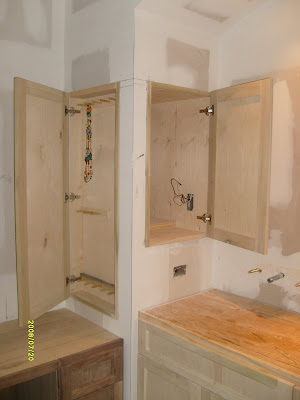
I have my super deep medicine storage cabinet, my custom jewelry cabinet , my tall linen cabinet, my 36” high sink vanity (no more stooping!) with perfectly aligned cabinet drawers and doors, and of course, my beautiful walnut vanity! I have wonderful full extension glides and European hinges. I have my simple recessed panel doors with a minimal bit of routing for detail. Since it was built on site it fits my bathroom like a glove. Well built cabinets are a true luxury and the people that build them are true craftsmen.
Wednesday, April 8, 2009
Plumbing Fixtures
Plumbing Fixtures
I have some fabulous plumbing fixtures going into my bathroom. They are heavy and feel good in your hand and have a lovely matte bronze finish. The wall mount faucet is a modern touch while the overall style is traditional. The shower will have a “Torrent” shower head with multiple spray options and a hand held sprayer with three spray options as well. It is thermostatic, so once you set it on the temperature you like, it will always come on that way. How luxurious!
The tub is the Kohler Serif bubble massager. I love the graceful oval shape, it relates to the oval shape of my sinks and my mirror over the vanity. I like not having the big jets inside the tub, just little pin holes for the water to shoot through. I only had a 5 ft. tub in there to start with and only a 5 ft. tub would go back in. Luckily, this beautiful curvaceous tub comes in a 5 ft model that fits my tub deck exactly!
The toilet is my favorite Kohler, Memoirs, Stately version. I like the traditional “crown moulding” look to the tank and of course, the comfort height and elongated bowl. As we get older, we all like the comfort height, a bit higher to make it easier to get up and down.
All of these products are of high quality and I can’t wait to use them!
Tuesday, April 7, 2009
Finishes
Finishes
The finishes for my bathroom are shown in the photo above. It took a long time to come up with the selections. I went through so many samples getting just the right color palette and look that I wanted.
My bedroom and bath had been a light grayed down blue color since we moved in back in 2000. I liked the blue as a cool, restful color in this hot climate, but I was tired of it. I decided to go for a light, soft green, almost light pistachio color scheme to keep it cool, relate it to my garden, and make it appealing to future buyers. “Green is gold” for resale you know!
It started with my granite I found at a stone yard about a year ago. It captured that color perfectly with a subtle pattern and not much variation. Some suppliers call it Costa Esmerelda, but it’s not the typical blue/green color of most Costa Esmereldas. It is more of a light pistachio. The granite will go on the countertops and tub deck. I also usually do the threshold of the shower in a stone for maintenance purposes.
From there, I looked for tile. I wanted my floor tile to be larger in scale and sort of serve as a background for the room. (Not much detail) I like porcelain tile for maintenance, but I much prefer tile that does not have the fake variation most of them do. I wanted a really soft, consistent look with rectified edges so that it could be butted together with a tiny grout line. Basically a monolithic floor with a hint of traditional style in the pattern, laid in a running bond. The tile I selected is from Arizona Tile, 18” x 18”, Fabula Avorio. It is a good neutral with a greenish cast to the color.
Of course, I couldn’t resist the “wow” factor. I went for 1” x 1” glass mosaics with a listello from Walker Zanger in this lovely subtle matte or sand blasted look finish. It looks like sea glass washed up on the beach! It’s beautiful in my color scheme of greenish neutrals with a bit of bronze color. The bronze relates to the metal finish on the fixtures and hardware in the room. This tile will go on the backsplash at the sink vanity and the tub as well as inset in the back wall of the shower.
I’m doing these wonderful light olive pebbles from Daltile in the shower stall. I love the look and feel of pebbles in a shower. It’s like a foot massage and gives a spa-like feel.
My paint color is still to be decided. I’ll wait until the tile goes in I think. I usually select everything before, but I’m not sure how much green I want in the wall color. I want a very light color, a lighter version of the floor.
I’ll show you my fabulous plumbing fixtures next!
Friday, April 3, 2009
Sheetrock!
I have sheetrock now and I love how clean the space looks. I think I’ll just leave it like this and put a toilet in. I guess a shower would be nice.
I had a smooth finish applied to the walls, no texture. It actually needs one more going over, after priming the walls. My sheetrock guys are sooo good, that’s all they do, sheetrock and texture. They do not paint or strip wallpaper! They always make that perfectly clear! (and if you’ve stripped wallpaper, you know why!) So I have to prime or get my painter to do that. I’ve decided to do that myself.
I stripped the wallpaper on the few existing sheetrock spaces we kept, and it was time consuming and miserable. I tried all kinds of products, but a steamer worked best. My skin was dewy soft and I was dripping when I finished the toilet room. The builders around here took the fast approach to applying the finishes in these houses and didn’t prime the walls before applying paper. They stuck it directly to the sheetrock, so if you aren’t very careful, you can take the sheetrock off with the paper and leave pock marks all over.
I’d like to say a word about my contractors. I firmly believe in getting the people that specialize in what they do to do the work. So many remodelers like to have one guy do several parts of the job. I’ve been on jobs where one contractor (hired by the homeowners against my advice) did all the sheetrock, painting, electrical, plumbing, everything! Then they are surprised when they get low quality work. First of all, I hire a master electrician and plumber on every job. They are always licensed and insured. The other contractors do their own specialty work all day long, so they are very practiced and can do the job in the most efficient way with the best outcome. It is apparent when you see the sheetrock work in my bathroom and it makes me very happy!
Monday, March 30, 2009
You Never Know!
You never know what you will find when you demo a space. Remodeling is always a surprise. We found a bed of carpenter ants just below the shower pan in my bathroom. Yuck! Luckily damage had not been done to the wood around it, but it would have been bad news if we’d waited too much longer. The contractor sucked a lot of them up with the shopvac before he called me in to see. (Gives me the heebeegeebees!)
Another thing I didn’t realize was all the pipes, ductwork, and electrical the builder had stuffed into the existing furr down. I anticipated plumbing and electrical, but we also had to reroute the ductwork which was unexpected.
I also will need a new shorter window at the tub. The tub deck was a bit too high for the existing tub and the builder had floated up over the window sill and tiled directly into the glass at the window. (Bad Detail!) Since my new tub is about the depth of the old one, I want to rebuild this properly and have my granite deck die into a wall faced with tile below the window. This way if water sits on the tub deck, it won’t sink down into cracks in the grout at the window and destroy the framing. My window, which was clear before, will now have textured glass (rain glass to match my front door). I had originally thought I had wanted a stained glass window, but I think that would command too much attention away from the other design elements in the room. I always had wood blinds there before which remained closed, but I’m going to do a Hunter Douglas, battery operated, Roman shade to have some softness, but still have translucency and light.
Thursday, March 26, 2009
Framing
The framing, electrical, and plumbing rough ins are done in my master bath and sheetrock is next! I can’t wait to see it take shape. I’ve taken special care to locate precisely where every outlet, switch, faucet, light fixture, etc. goes. I have provided special blocking in the walls for the toilet roll dispenser (that always wiggled out of the wall) and the medicine cabinets. I’m going to have an outlet inside my seated vanity cabinet for my hairdryer, so it will always stay plugged in. I have outlets in my extra deep medicine cabinets for electric toothbrushes and my husband’s razor, so they don’t have to sit on the counter. Every detail is important and changes like this make your bathroom so comfortable and custom made for you!
Saturday, March 21, 2009
Design Drawings for My New Bathroom
Here are the design drawings for my master bath. These are elevations for the sink wall and the vanity wall. Elevations show exact locations for wall mounted fixtures, design of cabinets, backsplashes, and any other architectural features. Elevating the walls helps you think through where everything will be placed and how it will function for you.
When designing this space I kept my program in mind. It is traditional with some modern features so as to look fresh and updated. It will be light colored overall to look as large as possible with dark bronze accents of plumbing fittings, hardware, lighting. The major focal point, the dark wood vanity, is seen directly across from the entry and will stand out in a beautiful stained wood finish. The dark vanity will tie in with the dark bronze finishes throughout the space. All other wood, (cabinets, trim, doors, etc.) will be painted the wall color so they don't distract the eye. The cabinetry is neatly detailed, with a recessed panel door and full overlay design, again to be traditional with a bit of a modern edge. The arch repeats arches in other parts of the house and nicely frames the mirror and sconce. The 1" x 1" mosaic glass tile with a listelle is a real feature - a big expense, but such a high quality and unique product it makes the bathroom really special. On the elevations, you can see the graceful shape of the wall sconce, placed exactly as I want it, centered in the arch. Everything has been well planned and carefully considered to make construction go smoothly and to avoid as many on site decisions as possible.
Thursday, March 19, 2009
"Before" Photos
The “Before” photos of my master bath shows the white, bleak, builder standard look and the leaky, broken plumbing fixtures and brass/glass shower enclosure. The big furr down above the vanity will be ripped out and a beautiful curved one will go in its place with the two sinks on the same wall. The tub, shower, flooring, cabinetry, everything is being replaced. You won’t recognize the space when it’s done…..in about two months!
More photos tomorrow!
Tuesday, March 17, 2009
Floor Plan for my Master Bath Remodel
The plan for my master bath remodel includes some minor wall construction, new cabinets, fixtures, and finishes. In the plan, I have relocated one sink to the adjacent wall for a double sink vanity. This leaves space for a custom built stained walnut “seated” vanity, the first thing you see when you walk into the space. It is designed to look like a beautiful piece of furniture. All other plumbing locations are the same to save on cost. I removed the small angled wall in the far corner and built furred out areas on either side of the long vanity to create much needed storage. I’m removing the door that swings in to the toilet room, it’s soooo tight you can’t even close it when you go in there! The new door will swing out now and will function much better. The entry door has changed from two 18” doors to a single 30”. I decided to use that space just to the right of the door for a new linen cabinet. Furring down above that area creates a small vestibule when you walk into the space. It gives some presence and created a nice squared off shape at the ceiling for the new crown moulding to be installed. These all seem like minor changes, but a well thought out plan can clean up the look and rid your space of everyday annoyances to make life so much more pleasurable!
By “well thought out”, I mean that every detail has been addressed before construction starts. What materials will be used and how? Exact placement and detailing of electrical, plumbing, lighting, cabinetry, etc. must be done. The details and placement of all these items affect the framing, done at the beginning of the job. A qualified designer is responsible for thinking these things through and making sure everything is addressed. When remodeling there are so many unexpected things that can go wrong (like finding carpenter ants!) that it is important to think through everything you can and be as prepared as possible.
Monday, March 16, 2009
How to Define What You Want
The absolute most important step in addressing the design of a space is defining your goal. I often see clients who are unhappy with their homes and want me to tell them what to do. I can do that easily if you can define your end result.
This is called the “Programming” phase of design. In this phase the designer gathers all the information needed to design the space. Photographs, measurements, inventories of existing items and furnishings to be used in the new space are all done and the desired end result is defined.
You may have magazine photos you have found that help define that look, colors in mind, or a certain style like French country or modern minimalism. You may be concerned with daily maintenance, resale value, or a tight budget that will limit your wants. You need to define who will be using the space, how will it be used, and the priority of all the desired items.
It is also important to define what you don’t want in the space. You may hate the color red or do not want to spend money on new cabinetry. Including your “don’t wants” in the program is just as important as the desires.
This takes some soul searching and a strong dose of reality. Many times clients think that because they have a designer they can dream up the world and we can magically give it to them, but some things are impossible. There are budget constraints and design issues, like marrying several different styles together. Sometimes you just have to choose and prioritize.
It took me a long time to do just that with my own bathroom, but I finally did. I decided that first and foremost I wanted beautiful materials presented in a simple and straightforward manner, nothing too tricked up or overdesigned. It should look like it effortlessly fell into place. I wanted color that doesn’t scream COLOR. I love colors that are soft and hard to define, that look one way in morning light and another in the evening. It needed to be traditional to work with the rest of the architecture of the house but have a modern edge so as to look fresh. I wanted a distinct focal point and some interesting features to keep your eye moving around the room. Beautiful lighting, hardware and faucets that feel good and solid in your hand, and of course, I have to consider the “R” word – resale! That meant I had to mind the budget and make it appealing to many types of people - a challenge, but not impossible.
There it is, my program. Now when choosing materials and designing details, all I have to do is go back to my program to reestablish my direction if I tend to go off course. This happens often in the design of a space. When I take clients on shopping trips, they sometimes see something they love and all of sudden want to use in their space, but it is entirely inappropriate for the program or direction we have chosen to go. At that point, you can evaluate your program to accommodate the change, or make the sometimes difficult decision to set aside the fabulous item you’ve just fallen in love with in order to keep yourself on track to your goal. Remember that your program is something you have carefully considered and set as your priority and the new favorite thing is really just an impulse. This is something your designer is there for, to guide you through those decisions. I have always considered it to be one of my strengths as a designer, to keep the focus on the desired vision.
Next posting - A Look at the Plan
Saturday, March 14, 2009
Making the Decision to Begin
Well, I’m finally ready….I think.
To say that my master bath is in a state of disrepair is being more than obvious. There is peeling wallpaper, faucets that are broken, a shower door that doesn’t close, three kinds of floor materials in one small space (vinyl, tile, and carpet – yuck!), and stains from my daughter’s last hair dye experiment. My husband has been begging me to spend the money and get it done and if you knew my husband, you’d know it must be pretty bad to elicit that response.
I’ve only been planning and dreaming about this project for way over a year now. I can design other people’s spaces much more easily than I can my own! I know all to well everything that’s out there and I love it all. Vessel sinks, undermount tubs, custom cabinetry, unique lighting, gorgeous tile, polished chrome, oil rubbed bronze, traditional, contemporary, transitional,…..how can I choose?
The problem was that I never really attacked it like one of my work projects, I just left it stewing on the back burner in my mind, picking up miscellaneous samples here and there or sketching for an hour or two on a weekend, not really addressing the design and finalizing decisions. I would get stumped on something, like the floor tile not being just the right color, and would wait until I happen to be heading to tile showrooms again, and then I would forget to get MY tile sample and then a year and half went by.
I’ve been very busy. Business has been good and I’ve had lots of projects. Design is my absolute obsession and I live and breathe it every moment of my day. Someone recently asked me what I do for fun. I automatically said, “I work!”, without even thinking. I am a one person operation at the moment and I do everything from design and meeting with clients to buying ink cartridges for my printer. Being a small business owner is very time consuming and my little bathroom project didn’t get top billing.
Mind you, I’m not a big “bathroom” type person anyway. I don’t really go to spas or take a lot of time with make up or luxurious soaks in the tub. I kind of get in and get out. I’m much more of a kitchen person, even a laundry room person (although I’d rather not be one of those). I used to like to cook and entertain, even though now I’m too busy, and I’ve always spent a lot of time in the kitchen. I’d rather spend money there than in the bathroom.
I also dread the mess of a remodel. I’ll have to go upstairs to shower and sleep and since I work out my home there will be contractors traipsing through my workspace every day. I know too well all the dust involved and how it permeates every nook and cranny in your home. I’m not looking forward to that.
But it has to be done. I couldn’t sell this house without a remodel of that bathroom, so I might as well enjoy it while I’m here. The time has come.
Next article…..How to Define What You Want
Subscribe to:
Posts (Atom)