Sunday, January 8, 2012

How Do You Hang Your Art?

Randomly? 


Elle Decor


Gwynn Griffith - Elle Decor


Tom Scheerer - Elle Decor


Richard Lambertson, John Truex - Architectural Digest


William F. Rawley - Elle Decor


More of a casual, eclectic, collected kind of vibe.  Add one at any time.  Take one away and only you would miss it. It's definitely about the collection.  You're saying that you like this subject matter or color or artist or whatever so much that you've bought it over and over again in many sizes, shapes, forms.  Almost as research..... or obsession?  Definitely passion.  It says something about YOU. That is what your interiors should do by the way.


Or do you prefer your art all in a row?


Jay and Yvonne Fielden - Elle Decor


Phoebe Howard


Dransfield and Ross - Elle Decor


Jacqueline Derry Segura - House Beautiful


Elaine Griffin - Elle Decor


Barry Dixon - Traditional Home


More formal, more controlled, more purposeful.  You've thought very hard about the overall look rather than the individual pieces.  Take one away and and the rest are nothing.  It's really kind of about the grid or mass the collection creates on the wall rather than the individual pieces of art.

The wonderful thing about design is that there are very, very few rules. (Don't let anyone tell you the opposite!)  It all depends on the look you want to create! 

And that's where the fun lies.


Wednesday, January 4, 2012

Pick Something

Some of the most successful interiors are developed by selecting one major element in a space and making it the star.  Everything else in the room plays a supporting role, remaining visually quiet. Like a choir with a soloist, a cast of actors in a movie with it's lead character, or a ballet troupe with a prima ballerina, not everyone or everything can shine all at once.  The more quiet the supporting parts, the more dramatic the outcome will be.


Ceiling - no showstopping, sculptural furnishings or colorful fabrics here....just that amazing ceiling.


Color - so rich you want to just wrap yourself up in it.


Pattern - the bed is almost non-existent, everything else plain.


Art - so dramatic, nothing else competes.


Vessel sink - with support from vanity top and walls.


Wall finish - the banquette is so neutral and unassuming by comparison.


Marble - details and cabinetry are all so simple.


Wallpaper - nothing else pretends to compete.


Sometimes it's best not to overwork everything in a space.  Let one thing stand alone and appreciate the plain-ness of the rest.


Image credits:  Robin Bell - House Beautiful, Eric Lysdahl - House Beautiful, Windsor Smith - House Beautiful, Alberto Pinto - Architectural Digest, Carla Aston - Aston Design Studio, Alessandra Branca - Southern Accents, David Kleinberg - Architectural Digest, Amanda Nesbit - House Beautiful

Monday, January 2, 2012

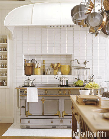
A Little Brass In The Kitchen

Architectural Digest  - Genevieve Faure

I'm loving a bit of brass in interiors these days.  It had such a bad turn for awhile there.  We're seeing it more and more and I love the warmth it brings to a space.  


Carole Lalli - House Beautiful


Mark Badgley - Elle Decor


Nancy Bozhardt - House Beautiful


Aerin Lauder-Zinterhofer - Elle Decor


Susan Dossetter - House Beautiful


So what do you think?  Would you do some brass in your kitchen?

Saturday, December 31, 2011

Tabletop - Christmas to New Years Eve


Christmas tabletop with bright red accents and greenery!


Generic burlap always gives such a nice textural base for a table top.


New napkins, tossing the crispy greenery, ready for New Year's Eve!


Happy New Year!!

Wishing you all the best for 2012!


Carla


Thursday, December 22, 2011

Last Minute Installations


This has been the typical load in my car the last 2-3 weeks, trying to get everyone's projects in and installed for Christmas.  Lots of window treatments, lighting, miscellaneous furniture items, and mirrors.  I'm finally there.... everything that's finished is in and I'm ready for a break!

Here's a peek at some of the items that were recently installed in a variety of projects.


Great window seat and pillows in these gorgeous Schumacher fabrics.


Custom traversing draperies in a master bedroom.


Statement light fixtures from Troy Ltg. for a master bath.


Another pretty Schumacher fabric with a Hunter Douglas vignette shade.


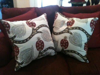
Pillows, pillows,


and more pillows.


Custom barstools in a Crypton fabric from Robert Allen that can withstand any stain imaginable.


Breakfast room chairs from Kravet that made it in time for Christmas!


Beautiful chairs from Kravet installed with a client's existing dining table.  Just in time for Christmas dinner!


Colorful ottoman in a Robert Allen fabric that was delivered today!


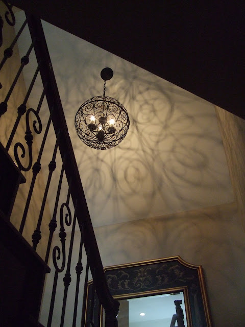
Coolest light fixture ever in a back stair.  LOVE!  From Currey and Co.


Funny package!  My electrician broke down and packaged up all 13 boxes that the lighting came out of and got it in this one big box, but he had no where in his truck to put it!  He made it work.  (If you're in The Woodlands, TX and need an electrician, you should use Bales Electric.  They are great!....You're welcome.)


Someone package me up.  I'm done!


Tuesday, December 20, 2011

Fresh Greens Mixed With Fake


I love fresh greens at Christmas, but the fact is they dry out so quickly inside your home.  At least with a tree, you can keep it in water, but fresh garlands just get downright crispy way before Christmas day.  Combining fresh and fake can get you close to the look and scent of a fresh garland.  Just keep the main structure with it's decor intact and change out the fresh as often as you like. 


Before - all fake


After with fresh clippings placed randomly in the garland - it's not so tight or controlled looking either.


One package grocery store greens - you could clip from your own garden or pick up at the neighborhood Christmas tree lot.


Fresh greens brighten up just about everything at Christmas.


They smell so good too!


It's almost here!  Are you ready?